The Explanations icon appears on queries that have AutoML Explanations applied to them from Discover. These explanations are generated in Discover when particular analysis calculations are applied to the query. These explanations can then be viewed downstream in presentations.
Auto-Explanations
Applying outlier, clustering, regression, forecasting, or fill blanks calculations to the query in Discover auto-generates an explanation in the Notes feature.
This explanation describes how the calculation was evaluated and which algorithm was used. The description contains the calculation name, the query attributes, and the method used to calculate the results.
Show Explanations
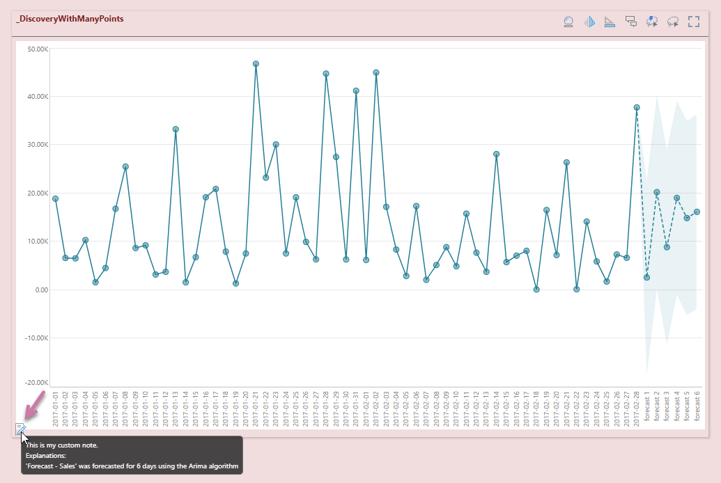
When a visual that contains an auto-generated explanation is added to a presentation, a Notes icon is shown on the visual when launched at runtime (see orange arrow below). Hover your mouse over the icon to read the explanation. The explanation contains the calculation name, the query attributes, and the method use to calculate the results.
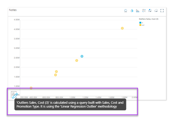
In the example below, the explanation describes how the outliers calculation was evaluated for the query:
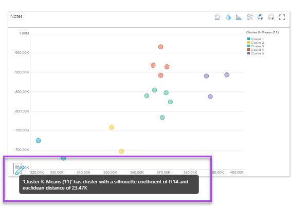
In this example, the explanation describes how the clustering calculation was evaluated:
In this example, the explanation describes the forecast and includes some custom text that was added manually (this example was built following the steps described in Showing Notes in Discover Pro):